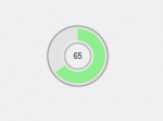
I‘m extremely impressed with the Google Chrome download indicator: for some kind of reason, a circular progress meter makes a lot more sense than a linear one. Maybe it’s because of Pi.
Since I was so impressed and because it was ‘Pi day’ the other day (Pi Day), I thought now was a good time to write a component that does just that: show the progress of something in a somewhat circular form. You can find the code right here: a reminder, it’s C# and that means it is meant for .Net. I’d be really surprised if it wouldn’t work on Mono (it should) [just tested and confirmed that it works].
A couple of notes:
- FillColor is the colour that’s used to fill up the circle
- ForeColor is used for the Text (progress text)
The code should be pretty clear in what it does: I was planning to also paint a bunch of “spokes” in the meter but couldn’t be bothered at the end1. It shouldn’t be too hard (use the sin/cos methods of the Math class to get the right x/y coordinates).
1 Also, this would have given it the Trivial Pursuit look: Google’s progress meter reminds me of that too.
03/16/09: Introduced drawing of Text/Label/Caption.
03/18/09: Good rewrite: Mostly introduction of ‘progressbar’ like properties and methods (Value, Min/MaxValue), Marquee. Introduction of a ProgressType enumeration (maybe should use the regular ProgressbarType). Also, same license (Commercial/personal free use, but please leave the credits in).
